

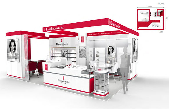
Each of Elizabeth Arden's top 50 counters in flagship markets like New York, London, Shanghai were redesigned and rebuilt to leverage the brand's iconic red door and classic red color palette. The design mandate across the world was to make Arden look like a contemporary, prestige beauty brand with a strong New York sensibility. CLIENT: Elizabeth Arden CD: Jeff Huggins, Ron Rolleston DESIGNERS: Paul McGlaughlin, Karen Gettinger, Kevin Roberson.

In key markets with flagship counters, we brought the brand's spa heritage to retail with built-in treatment rooms for facials, massages, blow outs, and make-overs. The cabine design was another important step in resurrecting the brand Ms. Arden built, with spa treatments and individualized, 1-to-1 service at the heart of everything the brand does.


Because the vast majority of Elizabeth Arden counters are in secondary markets, and are either unstaffed or share beauty consultants with other brands (who better incentivize them to sell Estee Lauder or Lancome products), it was essential to create a self-shopping experience at Arden counters. This was achieved by using iPads and mobile technology platforms to demonstrate and explain product benefits, self-diagnose skincare issues, and purchase products not sold in secondary markets.

